
AI Living Room Paint Colors: Preview Any Shade on Your Own Walls Before You Buy
Picking a living-room color from a tiny paint chip is guesswork — an AI paint color visualizer lets you upload one photo and see the shade painted on your actual walls, with your own light and furniture, in seconds. Previewing paint this way is one part of a full AI living room design workflow, where color, layout and furnishing choices all get tested before a single can is opened. This guide covers how AI previews paint on your walls, how to read warm versus cool undertones, what to do with trim and ceiling, which sheen a living room actually wants, and the most-loved 2026 colors — plus how your own light changes every one of them.

How AI Previews Paint Colors on Your Living-Room Walls
An AI paint color visualizer previews paint colors on your own walls from a photo, which is the entire point — no more holding a 2×3-inch chip against a wall and hoping. The workflow has become simple enough that most people finish it on a phone in a few minutes, and the results are close enough to reality that ordering a physical sample afterward is more of a confirmation step than a leap of faith.
What an AI paint visualizer actually does
Modern tools like the Sherwin-Williams Color Expert let you snap a photo of the room and virtually paint the walls; color-smart AI can even suggest hues that complement items already sitting in the space, like a rug or a piece of art. Broader visualizers such as Housepaint AI go further, carrying more than 19,800 real colors pulled from Sherwin-Williams, Benjamin Moore, Behr, PPG, Farrow & Ball, Valspar and Dunn-Edwards in one library. These tools auto-detect walls, trim and doors as separate surfaces and preserve the room’s natural lighting and shadow, so the render doesn’t flatten out into a cartoon wash of flat color.

Getting an accurate AI preview
A good render depends more on the photo you feed it than on which app you use. Before you trust what’s on screen, run through this sequence:
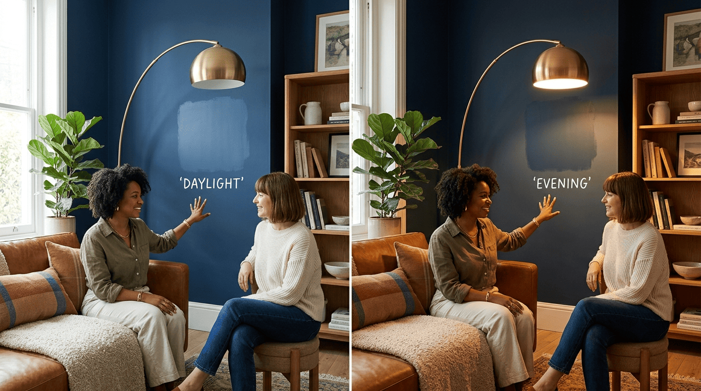
- Shoot the wall in daytime light and again under your evening lamps.
- Keep furniture in the frame so the AI has scale and context to work with.
- Test two or three shades side by side rather than one at a time.
- Preview trim and ceiling separately from the wall color.
- View the render on a color-calibrated screen if you have one — phone screens can shift a color’s warmth.
- Order a physical sample and paint a real swatch before you commit to gallons.
Warm vs Cool Undertones — the Thing That Trips Everyone Up
Every paint color has a warm or cool undertone hiding underneath its name, and that undertone is what actually determines how a room feels once it’s on four walls instead of a chip.
Why undertone beats the “main” color
Every neutral hides a warm undertone (yellow or red) or a cool undertone (blue or green) that only reveals itself once it’s spread across a large wall. Warm undertones feel cozy and inviting; cool undertones feel crisp and calm but can read cold in low or north-facing light. For 2026, warm is winning: designers are moving away from the cool grays that dominated 2015 through 2022 and toward creamy whites, greige, sage, terracotta and honey-amber. A color like Accessible Beige SW7036 is the textbook example of why undertone matters more than the name on the can — it reads beige in some light and gray in others, which is exactly what a warm greige is supposed to do.
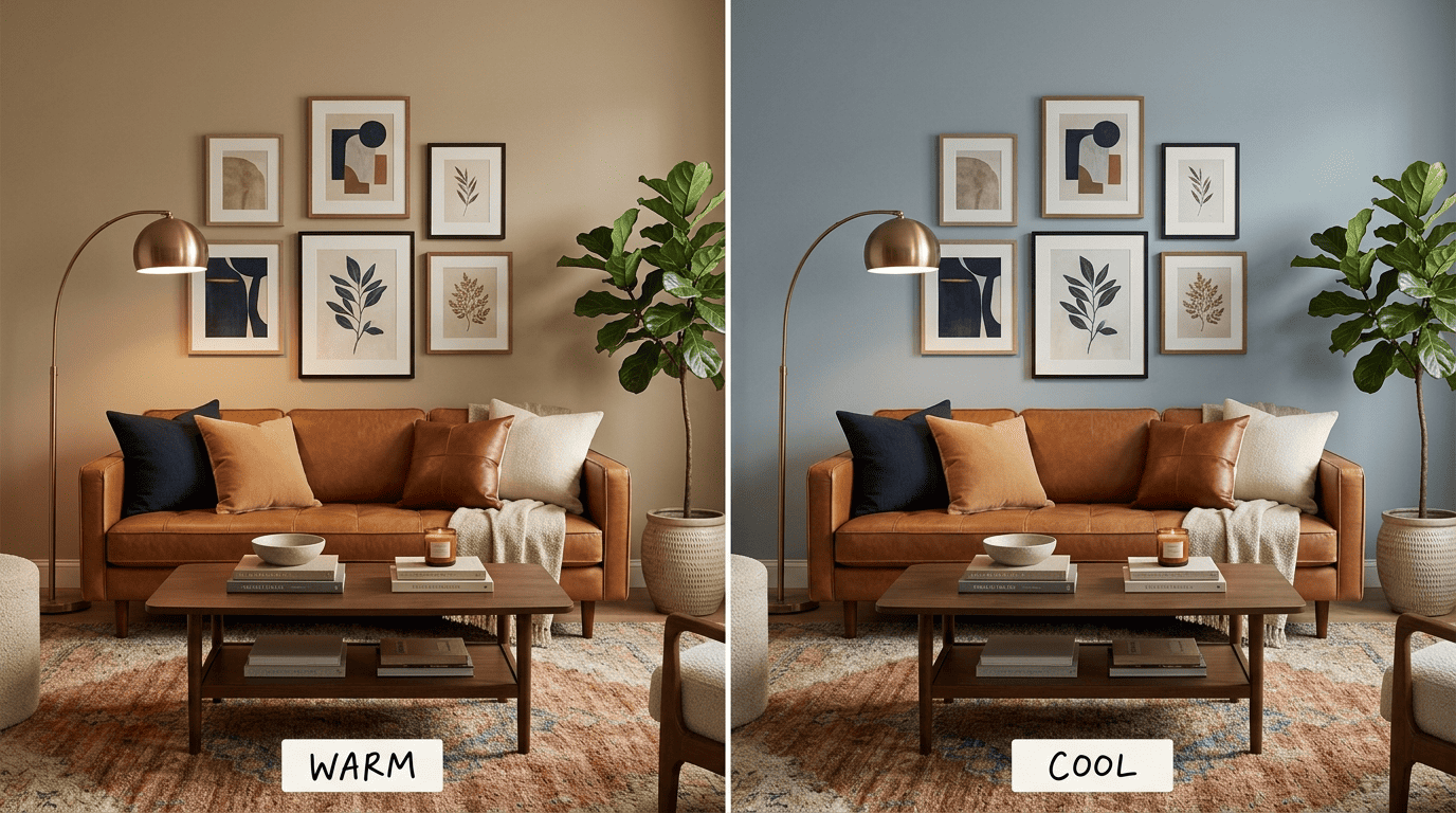
Living room walls suit an eggshell or satin sheen precisely because those finishes carry warm undertones a little more visibly than a flat matte does — more on that below.
| Color | Undertone | Mood it sets | Best light |
|---|---|---|---|
| Accessible Beige SW7036 | Warm greige | Grounded, adaptable | Any |
| White Dove OC-17 | Warm off-white (LRV 83.16) | Airy, soft | North-facing or low light |
| Agreeable Gray SW7029 | Warm greige | Calm, flexible | Bright rooms |
| Potter’s Clay BM 1221 | Warm terracotta | Enveloping | Warm-toned bulbs |
| Dry Sage BM 2142-40 | Muted warm green | Organic, restful | Natural daylight |
| Hale Navy HC-154 | Deep cool navy | Moody, cocooning | Well-lit rooms |
Trim, Ceiling and Accent Walls
Once the wall color is settled, trim and ceiling decide whether the room reads finished or slightly off — and they’re where an AI visualizer earns its keep.
The 3 surfaces AI lets you paint separately
Good visualizers tint walls, trim and ceiling independently, which means you can test a moody wall color against a soft trim without repainting anything twice. A dependable go-to for trim and ceiling is Benjamin Moore White Dove OC-17, a warm off-white with an LRV of 83.16 that never tips cold. It’s specified so often for walls, trim and cabinetry alike that it’s become something of a default answer whenever someone asks what white to use.
Trim & ceiling rules of thumb
- Trim usually reads best one or two steps brighter or whiter than the wall color around it.
- Ceilings work well in white or a lighter tint of the wall color — this lifts the whole room rather than boxing it in.
- Keep trim and ceiling in the same undertone family as the wall: warm with warm, cool with cool.
- An accent wall reads strongest on the wall with the least trim and fewest windows.
- Preview all three surfaces in AI before buying paint for any of them.
Sheen: Matte, Eggshell or Satin for a Living Room
Sheen gets less attention than color, but it changes both how a color looks and how the wall holds up to daily life — which matters a lot in a room that gets used every day.
How sheen changes color and durability
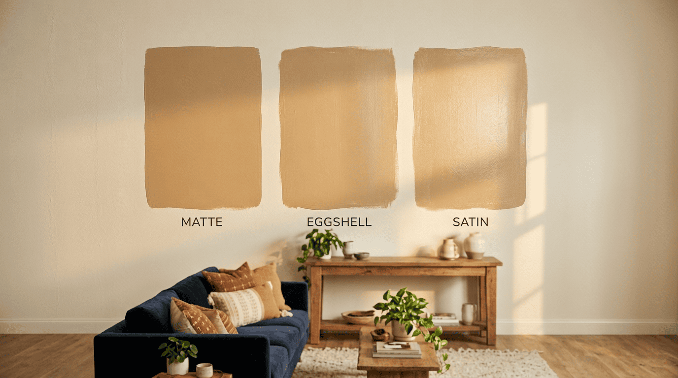
Per Sherwin-Williams’ paint sheen guide, finishes fall into a few groups: flat/matte reflects little to no light, eggshell and satin reflect low to medium light, and semi-gloss and gloss reflect the most. Higher sheen bounces more light and makes a color look slightly deeper and more saturated, but it also shows every wall imperfection more readily. Flat and matte finishes swallow light and hide flaws well, but they scuff more easily and are harder to wipe down — a real consideration in a living room where a couch gets pushed against the wall and kids or pets pass through daily.
| Sheen | Reflection | Hides flaws? | Washable? | Best living-room use |
|---|---|---|---|---|
| Flat / Matte | None to low | Yes, best | Low | Low-traffic feature walls, older walls |
| Eggshell | Low | Good | Moderate | The living-room default |
| Satin / Low-Lustre | Low to medium | Fair | Good | High-traffic family rooms, kids and pets |
| Semi-Gloss | Medium | No | High | Trim and doors, not walls |
Eggshell tends to be the safe living-room default, and it’s worth previewing at that sheen level in AI if the tool supports it, since the render can shift slightly once sheen is factored in.
The Most Popular Living-Room Paint Colors for 2026
Warm neutrals lead the pack by a wide margin. Accessible Beige SW7036 and White Dove OC-17 continue to top popularity lists, with Agreeable Gray SW7029 holding steady as the best-selling warm greige for buyers who want something a shade cooler without tipping into the gray-blue tones of a few years ago.
Earthy tones are the breakout category. Terracotta and honey-amber shades — think Potter’s Clay BM 1221 and Caramelized SW9186 — are showing up in living rooms that used to default to beige, often on a single accent wall rather than all four.
Green has effectively become the color of 2026. Sage green, in particular Dry Sage BM 2142-40 and Secret Garden SW6181, is the shade designers keep coming back to for its muted, organic feel that reads calm without going cold.
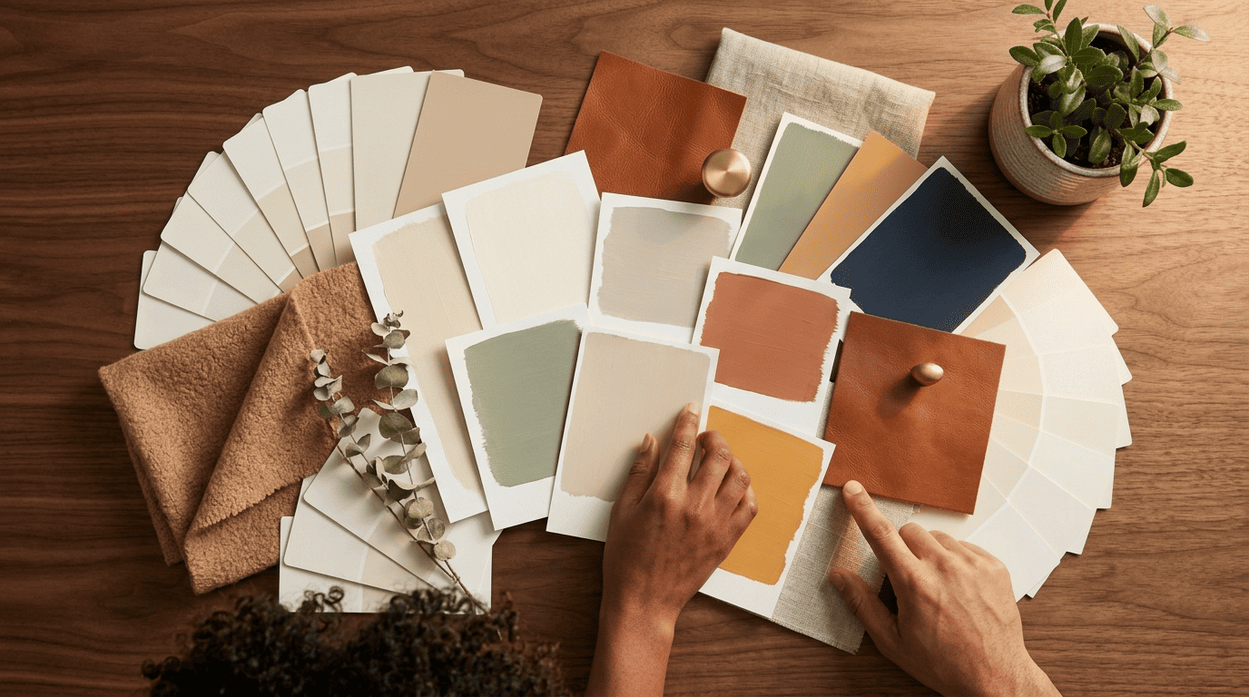
Moody colors are having a real moment too. Hale Navy HC-154 brings a classic, cool navy that cocoons a room in the evening, while Soot BM 2129-20 leans even darker with a charcoal, blue-leaning undertone for a jewel-box effect in smaller living rooms.
2026 living-room favorites, by group
- Warm neutrals: Accessible Beige SW7036, White Dove OC-17, Agreeable Gray SW7029.
- Earthy: Potter’s Clay BM 1221 (terracotta), Caramelized SW9186 (honey-amber).
- Greens: Dry Sage BM 2142-40, Secret Garden SW6181.
- Moody: Hale Navy HC-154 (cool navy), Soot BM 2129-20 (cool charcoal).
Every one of these is worth previewing with AI before buying, because the exact same paint code can look noticeably different from one room to the next.
How Light Changes Every Color (LRV, Orientation, Bulbs)
The paint chip at the store and the wall in your living room are lit by two completely different light sources, and that gap is where most color regret comes from.
Why the same color looks like two colors
This effect has a name: metamerism, where a color that matches perfectly under one light source looks different under another. A paint that looked flawless under the store’s fluorescent lighting can shift once it’s on your living room wall, simply because the light source changed. Room orientation plays a role too — north-facing rooms cool a color down, south-facing rooms warm it up — and so does the time of day and the color temperature of your bulbs, with warm 2700K bulbs pushing a color warmer and daylight 5000K bulbs pushing it cooler.
Read your living-room light before you buy
- Check which direction the room faces — north, south, east or west.
- Preview the color in AI using both a daytime photo and an evening photo.
- Note the color temperature of your bulbs (2700K warm versus 5000K daylight).
- Check the color’s LRV — a higher number means it’s lighter and reflects more light.
- Always sample the real paint on the actual wall for 24 hours before committing.
As one long-standing reference on the topic puts it:
In colorimetry, metamerism is a perceived matching of colors with different (nonmatching) spectral power distributions.
Wikipedia, Metamerism (color)
That’s the same principle at work when a “perfect” swatch turns out to be the wrong color the moment it’s on your wall — and it’s exactly why the daytime-plus-evening preview habit above is worth the extra two minutes.