
AI Living Room Decor: Style Your Space Room by Room With AI
AI room decorators now turn a single phone photo into a styled, shoppable living room — gallery walls, layered textiles, plants and all. Apartment Therapy spent more than two years testing free tools before ranking the best of them, and the pattern is consistent: AI is strongest at the AI living room design layer, not at re-planning your space. It handles the pillows, rugs, art and finishing touches that sit on top of a layout you already have.

This guide covers exactly how to decorate — not re-plan — a living room with AI, from moodboards to seasonal swaps, with the real designer rules that keep the results looking styled instead of generated.
How AI Actually Decorates a Living Room
Most AI room decorators follow the same logic behind the scenes. You give the tool a photo, it reads the walls, windows and furniture already in the frame, then generates a new decor layer without moving anything structural. That distinction — decor versus redesign — is what separates a useful tool from one that just makes pretty but unbuildable images.
From photo to styled room in three steps
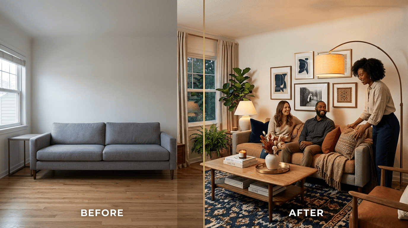
Nearly every current AI room decorator — Ideal House, Dehome, Decoratly among them — runs the same three-step flow: upload a photo, pick a style, generate. Decoratly advertises photorealistic results generated in seconds, not the days a traditional design consultation takes. Structure-preserving modes add decor elements like art, rugs and plants without shifting furniture, walls or windows, which is exactly the constraint you want when the goal is styling rather than renovation. The best input is a well-lit photo of one corner of the room, shot straight-on rather than at an angle.
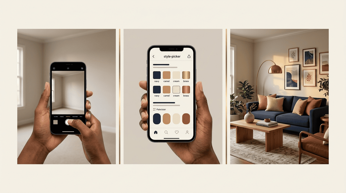
Decor vs. redesign — where AI shines
AI room decorators perform best on the “decor layer”: textiles, wall art, accessories and greenery — the elements you could realistically swap over a weekend. According to Apartment Therapy’s review of 13 free AI interior design tools, the strongest results came from tools that respected the existing room rather than generating a fantasy version of it. Layout, color palette and lighting plans are separate design problems; this guide stays focused on the finishing layer that sits on top of a room you’re not gutting.
Build a Decor Moodboard First
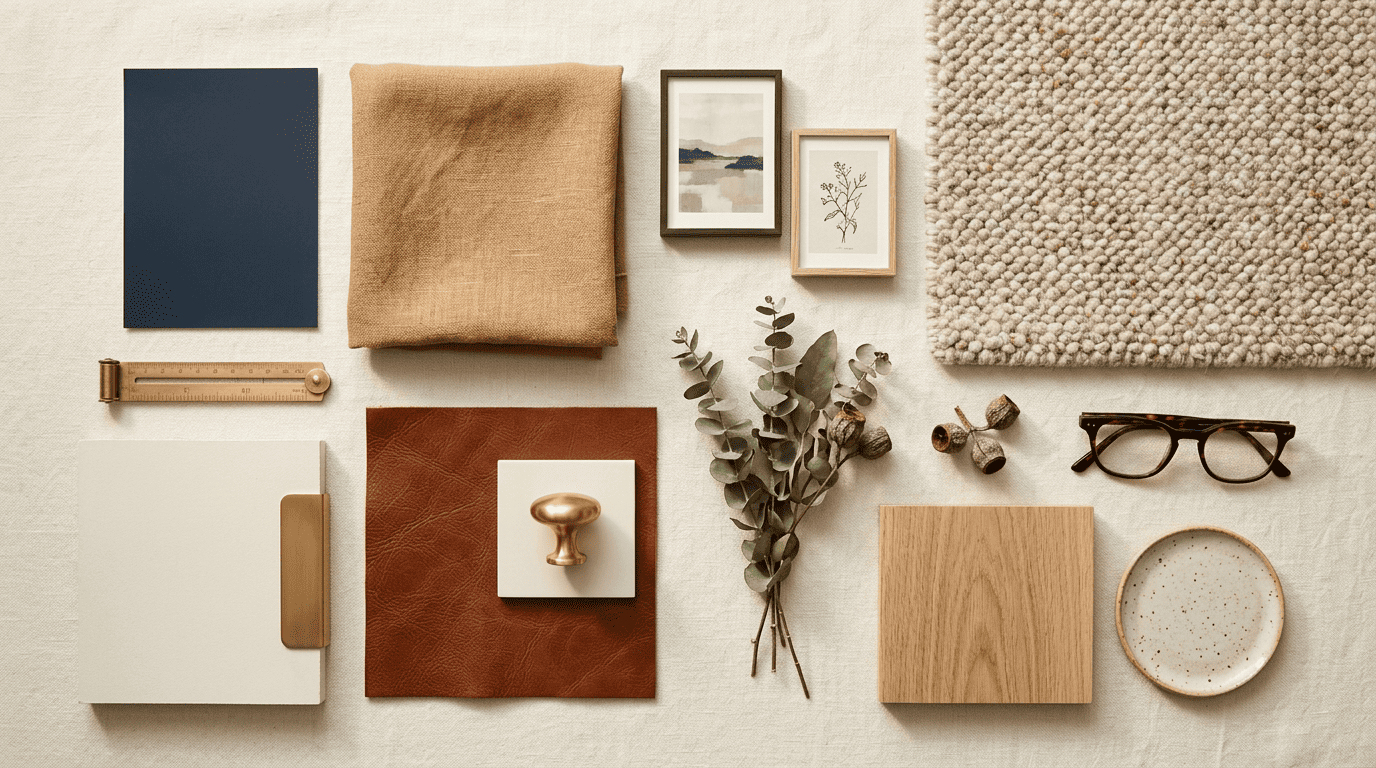
Before you generate anything, decide on a direction. A moodboard — a single collage of colors, textures and reference images — keeps every AI-generated option pointing the same way instead of drifting style to style.
Pick a style the AI understands
AI room decorators work from a defined vocabulary of named styles, not vague descriptions. Dehome alone supports eight or more style presets, and naming the style upfront narrows the tool’s choice of accessories automatically.
| Style | Typical accessories |
|---|---|
| Modern | Clean-lined art, low-profile rug, metal or glass accents |
| Scandinavian | Light wood, wool throws, sheepskin, sparse greenery |
| Japandi | Natural fiber rug, ceramic vases, muted linen cushions |
| Bohemian | Layered rugs, macramé, patterned textiles, trailing plants |
| Mid-Century | Sculptural lamps, walnut tones, graphic wall art |
| Industrial | Leather, exposed metal accents, oversized black-frame art |
| Traditional | Symmetrical pairs, tasseled trim, patterned upholstery |
Let one textile lead the palette
Homes & Gardens recommends starting with whichever fabric already carries more than three colors — usually a rug or a patterned cushion — and building the rest of the palette outward from it, rather than picking wall color first and hoping the textiles match later. AI moodboard generators, like Dehome’s, collect palette swatches and finishes onto one board so you can check that a rug, a throw and a set of frames actually sit together before buying any of them.
Gallery Walls and Wall Art
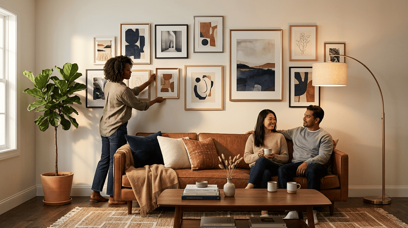
A gallery wall is one of the fastest ways to make a living room feel finished, and it’s also one of the easiest to get visibly wrong. AI visualization tools help you test layouts on your actual wall before you touch a drill.
The no-fail spacing rule
Emily Henderson Design’s gallery-wall formula holds up regardless of style: keep a consistent 3-inch gap between every piece in the arrangement. Trace each frame on paper, tape the tracings to the wall, or lay the full composition out on the floor before hanging anything.
Try and keep the space between all your pieces around 3 inches apart. That way things don’t get crowded.
Sara Tramp, Emily Henderson Design
With the layout mapped on paper or the floor, build the wall in this order:
- Hang the anchor piece — your largest artwork — first: in the outer corner for a small wall, or slightly off-center for a large one
- Place the second-largest piece diagonally from the anchor, not directly beside it
- Fill the space between and around those two before adding smaller pieces
- Mix horizontal and vertical orientations so a small vertical piece sits next to a large horizontal one, and vice versa
How AI speeds up gallery-wall planning
AI tools can render several layout options against a photo of your real wall in seconds, so you can compare five or ten grid-and-frame-mix combinations before committing to nails and hardware. Starting with three consistent frame finishes — or two modern frames plus one ornate piece as a contrast note — tends to read as curated rather than assembled from a clearance bin.
Cushions, Throws and Textile Layering
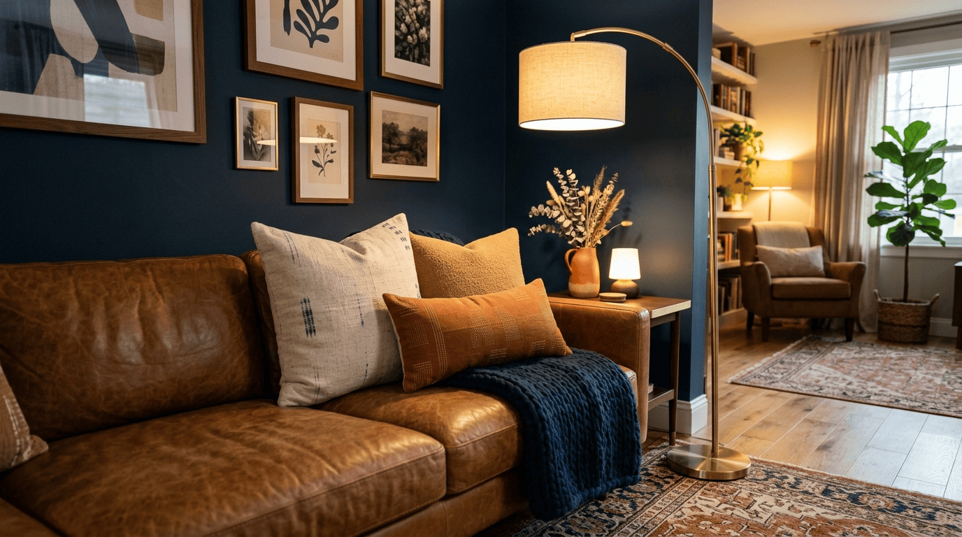
Textiles do more decorating work per dollar than almost anything else in a living room, and they’re the layer AI tools preview most reliably since nothing structural is at stake.
Mix sizes, textures and patterns
Layering cushions well comes down to a few repeatable habits:
- Use two to three pillow sizes on a sofa — commonly 22-inch, 20-inch and an 18-inch or lumbar shape
- Mix smooth and textured fabrics, such as linen with bouclé or corduroy, instead of one uniform material
- Add exactly one patterned accent pulled from the lead textile identified in your moodboard
- Keep the rest of the cushions solid so the pattern reads as a highlight, not noise
AI room previews let you test cushion colors against your actual sofa fabric before spending money on pieces that clash in person.
The throw that ties it together
A throw blanket works best draped asymmetrically over an armrest or the corner of a sofa rather than folded flat — the texture of a knit or mohair throw does more for the room’s warmth than its exact color match. Textile layering is the cheapest and fastest layer to refresh in the entire room, which is why most AI decorating tools default to it first.
Rugs, Plants and the Finishing Layer
Rugs and greenery anchor the room the way frames anchor a gallery wall — get the scale wrong and everything above it feels unmoored.
Size and place the rug right
According to Homes & Gardens’ living room styling guide, the minimum acceptable rug placement puts the front legs of the sofa on the rug with the floor visible around the perimeter; the better outcome puts all seating legs on one rug that defines the whole conversation area. Material matters as much as size — wool or hide rugs suit low-traffic, cozy corners, while sisal or jute stand up better to foot traffic and pets.
| Decor element | Primary effect |
|---|---|
| Area rug | Anchors the seating zone, defines room boundaries |
| Throw pillows | Adds color and textural contrast to seating |
| Gallery wall | Fills vertical space, sets a focal point |
| Houseplants | Softens hard corners and empty floor gaps |
| Coffee table styling | Adds intentional detail at eye level when seated |
| Seasonal accents | Refreshes the room without new furniture spend |
Plants and surface styling
Homes & Gardens suggests a spider plant on the coffee table and a money tree in an empty corner as reliable, low-maintenance starting points — greenery softens hard corners and half-empty shelves more cheaply than almost any other decor move. Styling a coffee table or shelf works best under the “rule of threes”:
- Vary height across the grouping — a stack of books, a candle or vase, and a plant
- Leave some negative space rather than filling every inch of the surface
- Repeat one material or color from the moodboard so the vignette ties back to the rest of the room
- Swap one item seasonally instead of restyling the whole surface each time
AI tools that add plants and small objects into a rendered photo make it easier to judge decor density before you buy anything.
Seasonal Refresh and Finishing Touches
A living room doesn’t need new furniture to feel updated for the season — it needs a handful of swapped accents.
Swap covers, not furniture
Ideal House offers seasonal presets — Cozy Fall Decor, Christmas, Halloween among them — that let you preview a seasonal look on a photo of your own room before buying anything. The actual swap is inexpensive: pillow covers, a throw, and a vase of seasonal stems or branches change three or four accents while the base furniture and rug stay exactly where they are.
From AI concept to shopping list
Once you’ve settled on a rendered look, converting it into a real purchase list follows a short, repeatable sequence:
- List the three to five key items the render actually changed — typically a rug, three pillows, an art set, and one plant
- Measure the space each item will occupy, including rug dimensions and frame sizes for a gallery wall
- Search by the style and color pulled directly from your moodboard, not by browsing broadly
- Buy the largest anchor piece first — usually the rug or the main art piece — since everything else is scaled around it
- Add textiles and plants last, since they’re the cheapest items to adjust if the first two choices shift the palette
Working the AI room styling process in that order — anchor first, accents last — keeps a shopping list from ballooning past what the original photo actually called for.