
AI Living Room Color Scheme: How to Choose a Palette That Actually Works
Choosing a living-room color scheme used to mean guessing from tiny paint chips taped to a wall — now an AI living room design assistant can render any palette on a photo of your actual room in seconds. The whole approach still rests on classic color theory: pick a dominant hue, a secondary hue and an accent, keep the undertones in one family, and test the result in your own light before you buy a single can of paint.
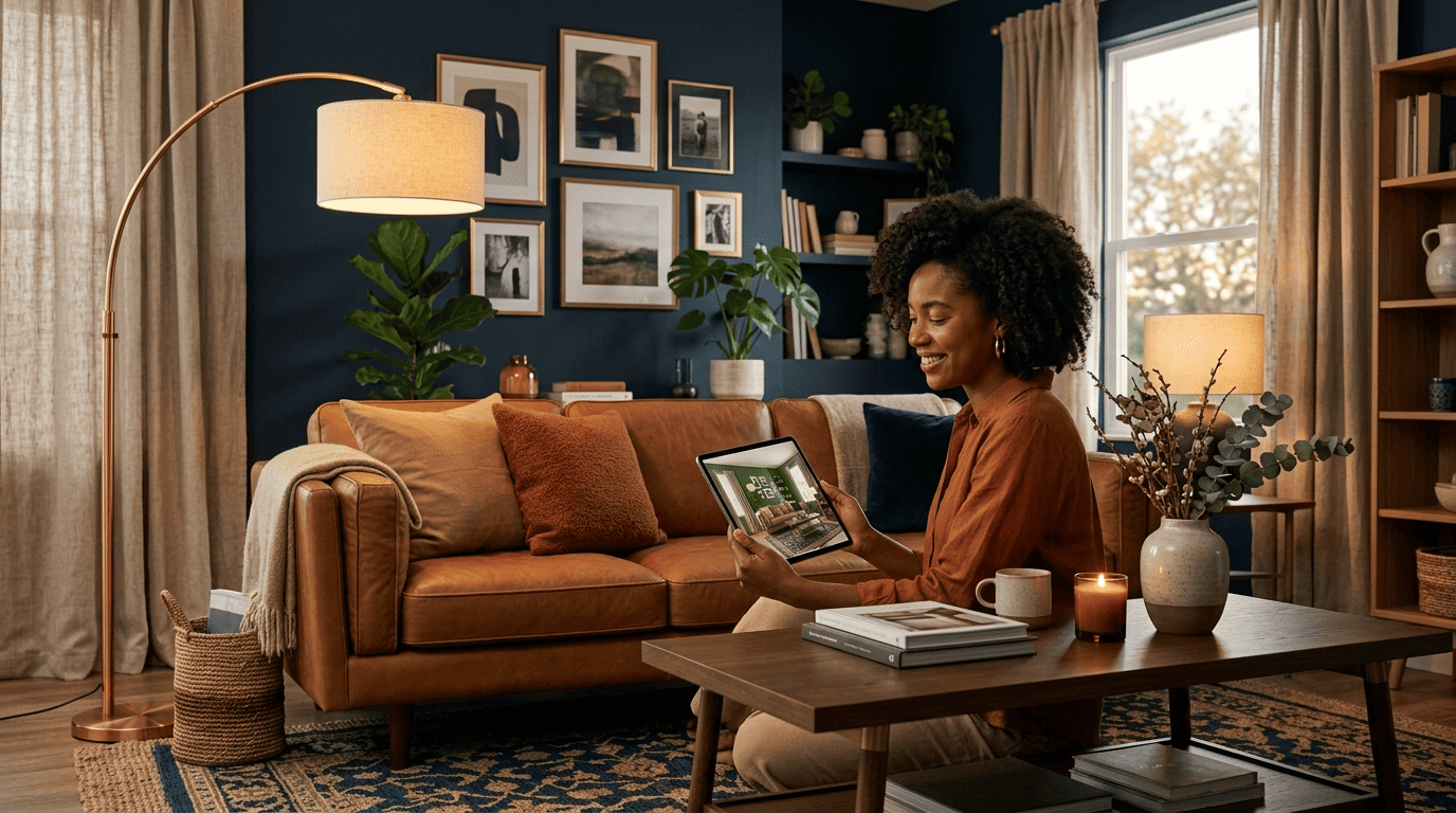
This guide walks through how AI does the heavy lifting, the rules professional decorators actually use, and ready-made palettes — including navy plus camel plus cream — you can drop into your living room today.
How AI Picks a Living Room Color Scheme
Handing the first round of decisions to software sounds like a shortcut, but it works because computer vision can isolate exactly the surfaces a painter would tape off, then swap colors on them without touching the rest of the photo.
What an AI color visualizer actually does
You upload a photo of your living room, and the tool uses smart segmentation to detect the walls, ceiling, floor, and large furniture as separate zones. It then repaints the selected surface while preserving the room’s real lighting, shadow, and texture, so the result looks like a photograph rather than a flat color swatch pasted on top. Beyond a single wall, an AI color visualizer suggests full combinations matched to your existing sofa, flooring, and light — one widely used tool, Spacely, reports more than 580,000 users leaning on this exact workflow. The net effect is that you remove the guesswork baked into tiny paint chips and can compare a dozen directions before committing to one.
Where AI helps most — and where taste still wins
AI is fastest at the repetitive, error-prone parts of the process:
- Testing many color options back to back without repainting anything.
- Matching an inspiration photo by pulling its exact HEX or RGB values.
- Previewing how a wall reads in morning light versus evening light.
Human judgment still owns the final undertone call and how a color actually feels once you’re standing in the room — a screen preview and an in-person impression aren’t identical. The most useful way to frame it is that an AI room design tool accelerates the search, but you make the final decision with your own eyes.
The 60-30-10 Rule (Your Palette Backbone)
Interior designers have leaned on one ratio for decades because it prevents the two most common failure modes: a room that feels chaotic from too many colors, or one that feels flat from too few.
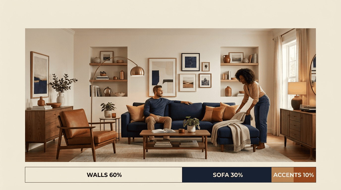
60% dominant, 30% secondary, 10% accent
The rule allocates 60% of the room to a dominant color, 30% to a secondary color, and 10% to an accent color. In practice, the dominant 60% covers the walls and largest furniture pieces, the secondary 30% covers the sofa, an area rug, and curtains, and the accent 10% covers pillows, art, and lamps. Wood tones — a coffee table, floorboards, a wood-framed mirror — count toward whichever share they visually dominate, usually the 60% or 30%.
| Role | Share | Where it lives | Example |
|---|---|---|---|
| Dominant | 60% | Walls, ceiling, large furniture | Warm greige walls |
| Secondary | 30% | Sofa, rug, curtains | Camel sofa, woven rug |
| Accent | 10% | Pillows, art, lamps | Cream and brass pillows |
The Rule of Odds and small tweaks
Repeat the 10% accent color at least three times across the room — a pillow, a lamp base, a piece of art — so it reads as an intentional choice rather than a stray object. Two useful variants exist: a 60-30-5-5 split when you want two distinct accent colors instead of one, and a monochromatic split where the lightest shade takes 60%, the mid-tone takes 30%, and the darkest shade takes just 10%.
Undertones: The Make-or-Break Detail
Two colors can look nearly identical on a paint chip and still clash badly on a wall, and the reason almost always comes down to undertone.
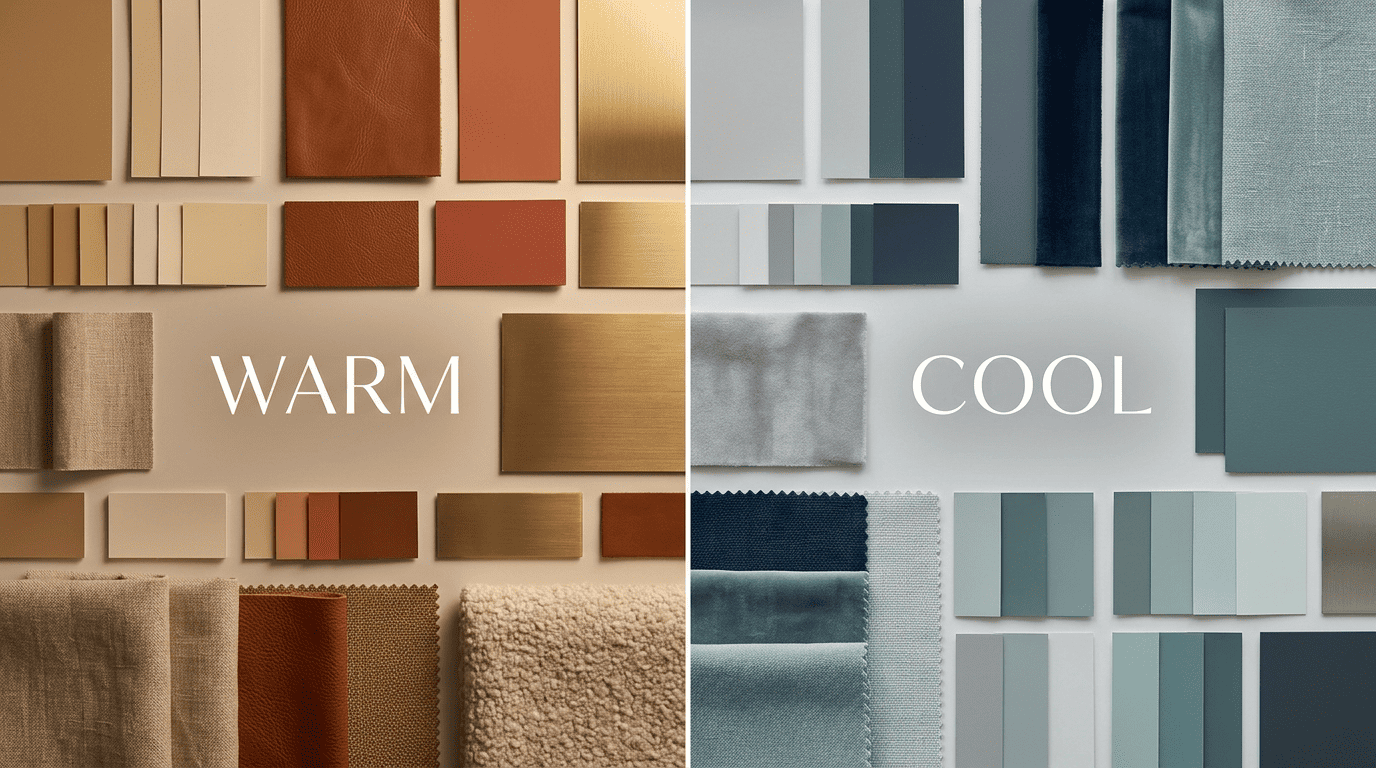
Warm vs cool — and why mismatched undertones clash
An undertone is the subtle secondary hue hiding underneath a paint’s main color, and it determines whether two colors coordinate or fight each other. Warm walls with yellow, orange, or red undertones pair naturally with olive, rust, and camel accents. Cool walls with blue, green, or purple undertones pair naturally with slate, charcoal, and blue-greens. Keeping the 60% and 30% shares in the same undertone family is the single most reliable way to make a scheme feel cohesive rather than accidental.
The pure-white test (AI does this instantly)
Holding a color swatch next to pure white reveals its hidden bias in seconds: a “neutral” beige can lean pink, yellow, or gray, and a “neutral” gray can lean blue, green, or purple. Sherwin-Williams’ own color visualizer is built around exactly this kind of side-by-side comparison. AI color tools automate the same test and surface a paint’s underlying bias automatically, which is one of the fastest ways to avoid an undertone mismatch before you paint.
Warm vs Cool: Set the Mood First
Beyond mechanics, temperature is the fastest lever for mood. Warm colors like terracotta, camel, and cream read as cozy and inviting, encouraging conversation and comfort. Cool colors like gray, blue, and soft greige read as calm and focused, which suits a living room that doubles as a reading or work space. Blue in particular has a calming effect, while green tends to feel balancing rather than energizing or subduing.
What each temperature does to a room
| Mood you want | Warm palette | Cool palette | Works best in |
|---|---|---|---|
| Cozy, inviting | Camel + cognac + cream | — | North-facing rooms needing warmth |
| Calm, restful | — | Soft gray + navy + white | South-facing rooms with strong light |
| Energetic | Terracotta + rust + sand | — | Living rooms used for gathering |
| Focused, quiet | — | Charcoal + greige + white | Rooms doubling as a home office |
Matching the palette’s temperature to the room’s natural light and orientation ties the two decisions together instead of treating color and light as separate problems.
Coordinating Walls With Your Sofa and Textiles
Most living-room color decisions aren’t made from scratch — they’re made around a sofa, a rug, or curtains you already own and don’t plan to replace.
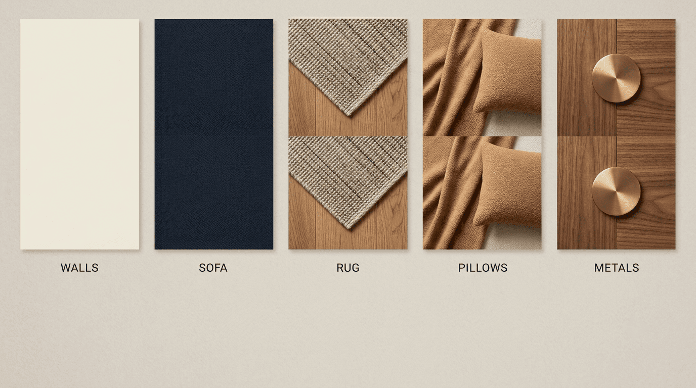
Start with the biggest piece you’re keeping
If the sofa is staying, build the rest of the palette around it rather than the other way around. A navy sofa pairs especially well with camel, cream, and brass warm accents, softening the depth of the blue without competing with it. A neutral sofa gives you the most freedom in the accent layer, since almost any 10% color will sit comfortably against it. A simple checklist keeps the layers straight as you shop:
- Walls (60%): pick the dominant undertone first — everything else follows it.
- Sofa (30%): the anchor piece; build outward from whatever you’re keeping.
- Rug and curtains (30%): should echo the sofa’s undertone, not introduce a new one.
- Pillows and art (10%): the accent layer — this is where you can be bold.
- Metals (accent): treat hardware and lighting as a color decision, not an afterthought.
Metals count as a color too
Metal finishes function as a neutral in the palette, and sticking to one metal throughout the room reads as more formal and intentional than mixing several. Brass and gold suit warm palettes, while chrome and nickel suit cool palettes. Letting hardware clash with the wall’s undertone is a small detail that undercuts an otherwise well-planned scheme.
Color-Wheel Schemes for the Living Room
Once undertones and the 60-30-10 split are settled, the color wheel offers three tested structures for choosing the actual hues.
Monochromatic, complementary, analogous
- Monochromatic: one hue in several tints and shades. Limit it to three or four shades total, or the room starts to feel flat rather than restful.
- Complementary: two hues sitting opposite each other on the wheel, typically pairing a warm color with a cool one — think navy walls with camel accents.
- Analogous: three neighboring hues on the wheel, with the middle hue taking the dominant 60% role and the two flanking hues splitting the remaining shares.
Wikipedia’s overview of color scheme types is a useful reference if you want the formal definitions behind each structure before applying them.
5 Popular Living-Room Palettes (Copy These)
If building a scheme from theory feels slow, these five combinations are proven starting points that map cleanly onto the 60-30-10 rule.
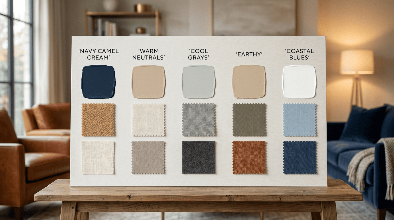
The palette cheat-sheet
| Palette | 60% | 30% | 10% | Mood | Sample paint |
|---|---|---|---|---|---|
| Navy + Camel + Cream | Warm cream walls | Navy sofa | Camel and brass accents | Grounded, warm | Benjamin Moore Hale Navy |
| Warm Neutrals | Beige/cream walls | Terracotta textiles | Taupe accents | Soft, inviting | Sherwin-Williams Accessible Beige |
| Cool Grays | Light gray walls | Charcoal sofa | Black accents | Modern, calm | Sherwin-Williams Peppercorn |
| Earthy / Terracotta | Sandy beige walls | Olive textiles | Rust accents | Grounded, natural | Warm earth-tone neutral |
| Coastal Blues | White walls | Sky-blue textiles | Navy accents | Airy, fresh | Crisp cool white base |
The Benjamin Moore color trends page and Livingetc’s decorator’s guide to the 60-30-10 rule are both good places to see these named colors applied in real rooms before you commit to a can.
Signature pick: navy + camel + cream
Navy, camel, and cream earns its reputation as a hero combination because each color does a distinct job: deep navy grounds the room and keeps it from feeling washed out, camel adds warmth without competing with the navy, and cream lifts the whole scheme so it doesn’t read as heavy. Walls typically carry the cream, the sofa or an accent chair carries the navy, and brass hardware or lamp bases finish the look. The interplay is a direct application of a principle the artist and color theorist Josef Albers built his teaching around:
In visual perception a color is almost never seen as it really is — as it physically is. This fact makes color the most relative medium in art.
Josef Albers, Interaction of Color
Test Before You Commit
No visualizer, AI or otherwise, fully replaces seeing a color on your actual wall under your actual light. A short testing routine catches mismatches before they turn into a repaint.
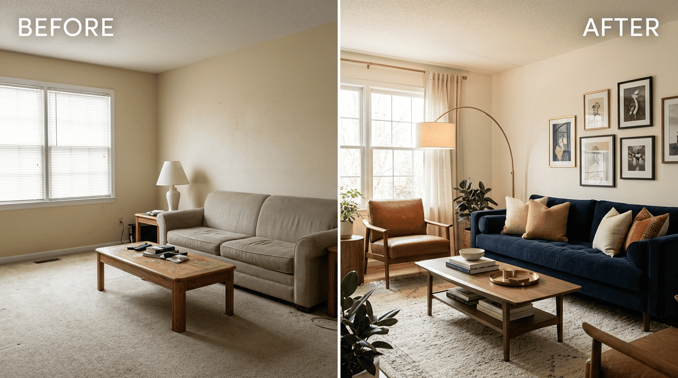
Samples, lighting and time of day
- Paint swatches at least 12×12 inches — small chips and even standard sample cards are too small to judge accurately.
- Buy 2-3 sample pots of your top contenders rather than committing to one immediately.
- Live with the swatches on the wall for 3-5 days before deciding.
- Check the color at three points in the day: morning, midday, and evening.
- Hold the swatch next to your sofa and flooring, not just against the wall.
- Note your room’s orientation — north-facing rooms get cooler, bluer light; south-facing rooms get warmer light.
- Preview the same color with an AI living room color tool to see how it shifts across those light conditions before buying full cans.
Following that sequence in order is the cheapest insurance against a color that looked perfect on a screen and wrong on the wall.